Morrow Ashby Architects
A portfolio website for a 12-person architecture practice in Leith: project index, project pages and a studio page.
- Client
- Morrow Ashby Architects
- Industry
- Architecture
- Location
- Edinburgh, UK
- Services
- UX & information architecture, Web design, Design system, Responsive build
- Year
- 2026
- Project
- Self-initiated concept
Overview
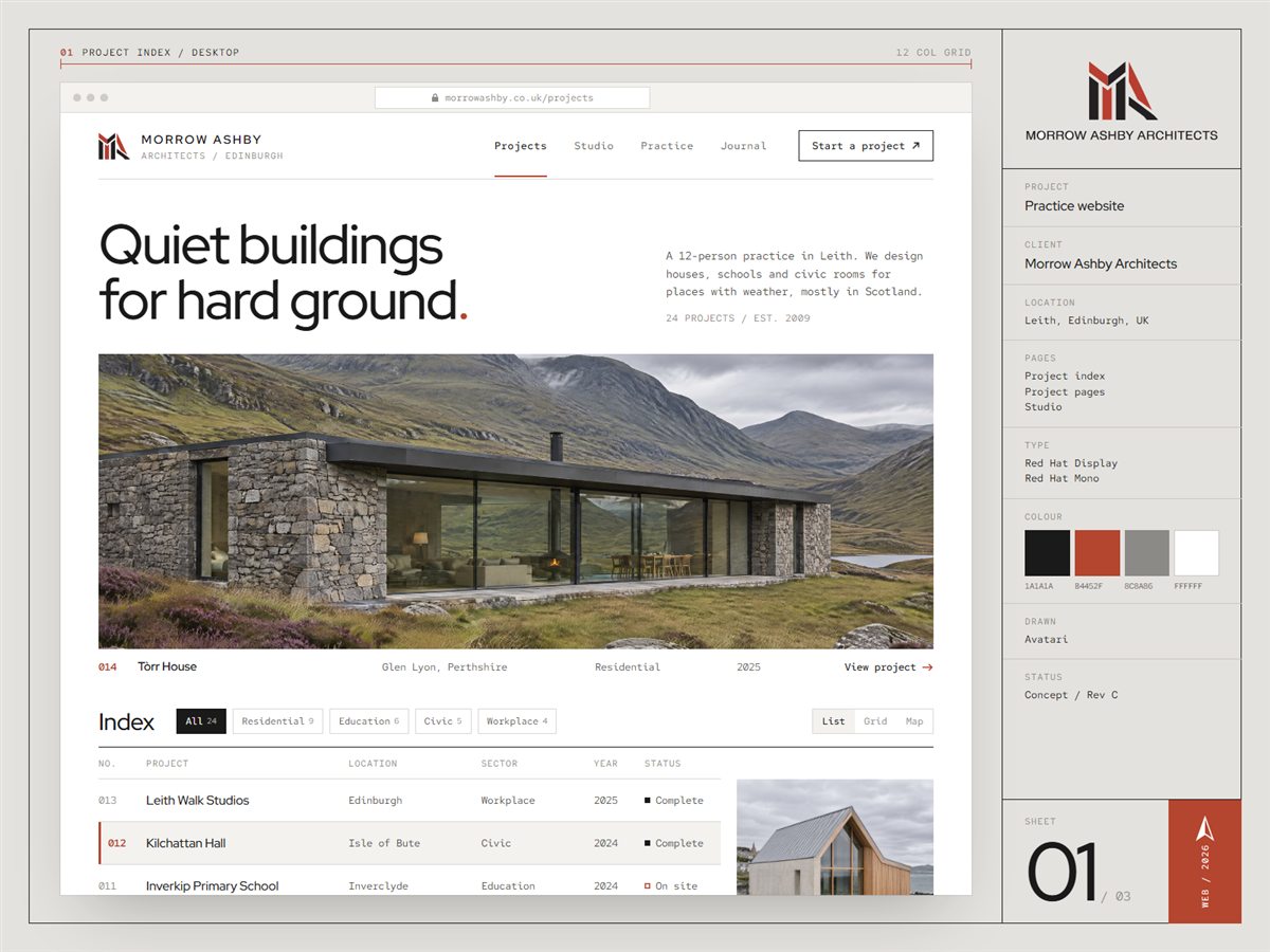
We designed a portfolio site for Morrow Ashby that lets the buildings do the talking: a sortable project index, project pages that read like a well-kept drawing set, and a studio page that introduces the twelve people behind the work.
The challenge
Morrow Ashby's work lived in a PDF brochure and an old gallery site with no order to it. Clients, planners and graduates looking for one school or one house had to scroll through every photo the practice had ever taken. Project facts such as location, area, engineer and completion date were scattered across captions or missing.
What we did
- 01
A strict 12-column grid and a near-black, oxide red and concrete grey palette taken straight from the logo, so the site feels as considered as the buildings, with lots of white space and photography given full width.
- 02
A project index built as a filterable list: number, project, location, sector, year and status in Red Hat Mono, with a hover preview image beside the table, plus grid and map views for people who browse by picture or by place.
- 03
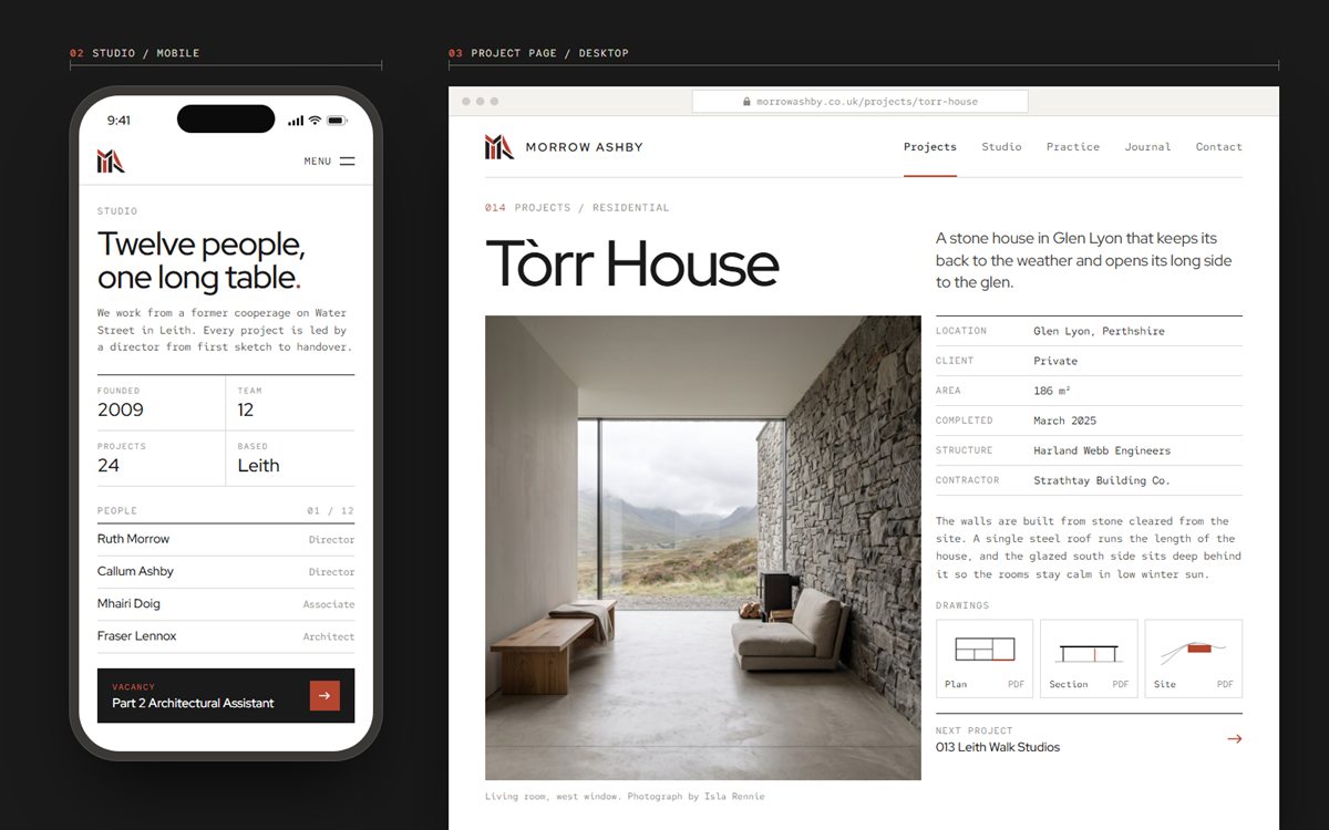
Project pages that open with the name and a one-line idea, then pair a large photograph with a fact table and downloadable plan, section and site drawings, ending on a link to the next project.
- 04
A studio page designed mobile-first, with the practice in four numbers, the team as a plain list of names and roles, and open vacancies pinned at the foot of the page.
Design system
Near Black
#1A1A1A
Oxide Red
#B4452F
Graphite Grey
#8C8A86
Concrete
#E4E2DE
Paper White
#FFFFFF
Display · Red Hat Display
Aa
Text · Red Hat Mono
The quick brown fox jumps over the lazy dog.
The design aims to make any project findable in a couple of clicks, give planners and clients the facts they need on one screen, and present a small practice with the clarity and restraint of its own architecture.