Ripe
A same-day grocery app that brings produce from Victorian farms to Melbourne kitchens.
- Client
- Ripe
- Industry
- Grocery delivery
- Location
- Melbourne, AU
- Services
- Brand identity, Product strategy, UI/UX design, iOS & Android app
- Year
- 2026
- Project
- Self-initiated concept
Overview
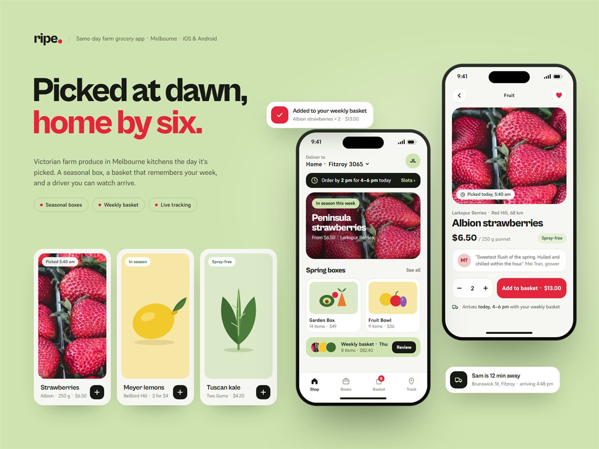
We designed Ripe as a calm, confident grocery app: seasonal boxes, a weekly basket that repeats itself, and delivery tracking that shows every step from farm gate to front door.
The challenge
Ripe works with small farms around Victoria and delivers the same day things are picked, but its first app looked like every other supermarket catalogue. Customers couldn't see where their food came from or when it would turn up, and rebuilding the same order every week was a chore. Seasonal swaps, like asparagus finishing for the year, read as errors rather than the point of the service.
What we did
- 01
A home screen led by what's in season this week, with a single delivery promise ('order by 2 pm for 4–6 pm today') pinned at the top so the core offer never scrolls away.
- 02
Product pages that put the farm, distance and pick time ahead of the price, with a short note from the grower, so freshness is something you can see rather than a marketing claim.
- 03
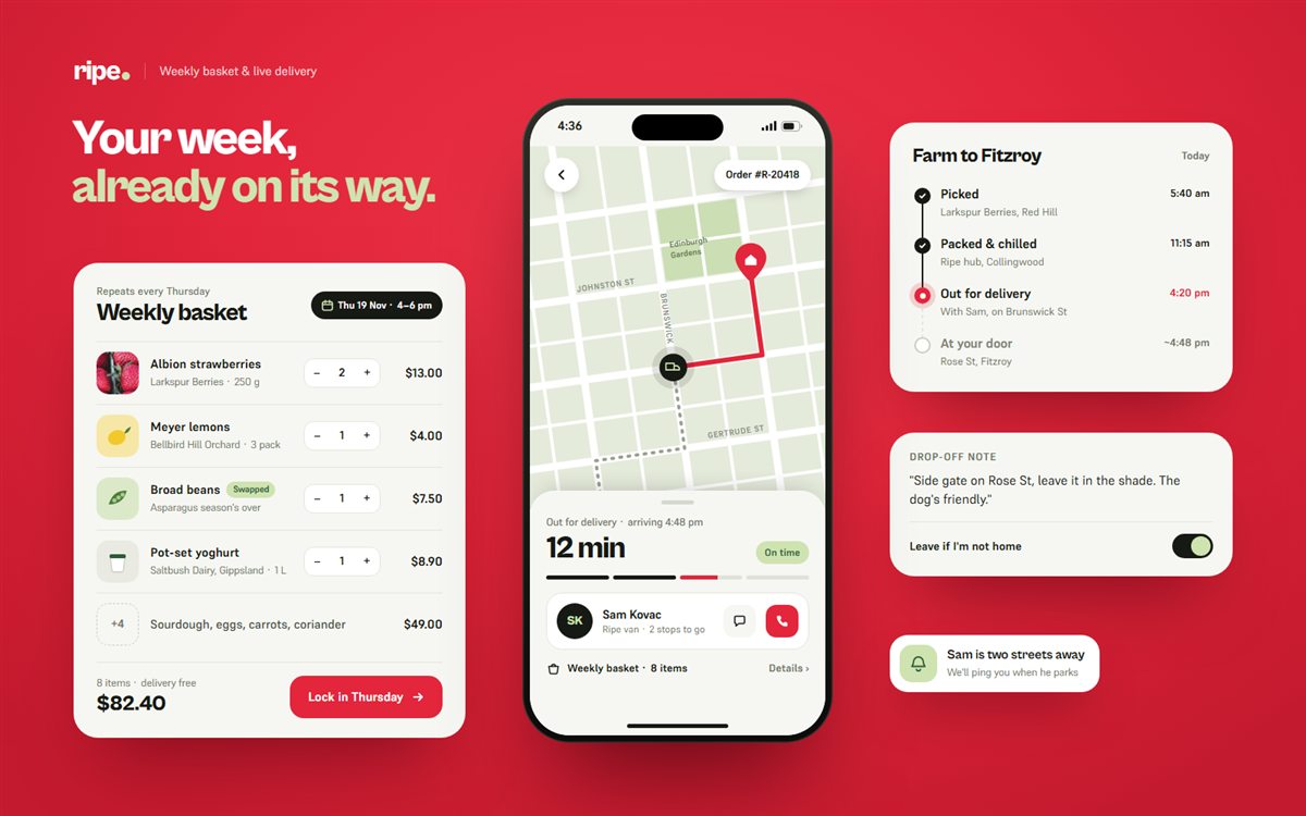
A weekly basket that repeats on a set day and flags seasonal swaps clearly, so changes feel deliberate and a whole week's shop takes a quick review instead of a rebuild.
- 04
Delivery tracking that tells the whole story, from picked to packed to out for delivery, with a live map, the driver's name and a drop-off note, all built on a strawberry-red and pistachio palette with Cabinet Grotesk headlines.
Design system
Strawberry
#E3263B
Pistachio
#CFE3B0
Loam
#171A14
Rind
#F6F7F2
Leaf
#2F5D3A
Display · Cabinet Grotesk
Aa
Text · Supreme
The quick brown fox jumps over the lazy dog.
The design aims to make freshness visible at every step, cut the weekly shop down to a quick review, and turn seasonal swaps into a reason to trust Ripe rather than a reason to complain.