What to Include in Brand Guidelines: A Practical Checklist
Brand guidelines turn a logo and a few colors into a system anyone can use. Here's exactly what to put in yours, section by section.
In this article
A brand identity only works if people use it correctly. The moment a second person designs a flyer, writes a social post or briefs a printer, small differences creep in: a stretched logo here, a slightly wrong blue there. Over a year, those small differences add up to a brand that feels inconsistent.
Brand guidelines, sometimes called a brand book, are how you prevent that. They explain your identity in a way that anyone can follow, whether it's a new marketing hire, a freelance designer or a sign maker.
This checklist covers what to include, why each section matters, and how to keep the document useful rather than decorative.
1. A short brand introduction
Start with one or two pages that explain who the brand is for and what it stands for. This isn't a mission statement for its own sake. It gives everyone who uses the guidelines the context to make good decisions in situations the rules don't cover.
Include:
- A one-sentence description of what the business does and for whom
- Three to five brand values or personality traits
- The feeling the brand should create
2. Logo usage
The logo section is the one people use most, so make it clear and visual.
- Primary logo and variations: horizontal, stacked, icon-only, and when to use each.
- Color versions: full color, one-color, reversed (light on dark).
- Clear space: the empty space that must surround the logo, usually defined using part of the logo itself.
- Minimum size: the smallest size for print and for screens.
- Misuse examples: show what not to do, such as stretching, recoloring, adding effects or placing the logo on busy photos.
Examples of misuse are more effective than written rules. People remember a picture of a squashed logo far better than a sentence about aspect ratios.
3. Color palette
List every brand color with its exact values for each medium:
- HEX and RGB for screens
- CMYK for standard print
- Pantone where spot colors are used for print or packaging
Then explain how the colors work together. Which is the primary color? Which colors are for accents only? What ratio should a typical layout follow? A palette without usage guidance often ends up with every color used equally, which dilutes the brand.
Also check text contrast. Note which color combinations are accessible for body text, so your website and documents stay readable for everyone.
4. Typography
Name the typefaces and show how to use them:
- Headline and body fonts, with the weights you use
- A type scale: sizes for headings, subheadings and body text
- Line spacing and letter spacing guidance for headlines
- Fallback fonts for situations where the brand fonts aren't available, such as email or shared documents
Make sure the licensing is clear, especially for fonts used on websites or in apps.
5. Graphic elements and patterns
Many identities include patterns, shapes, icons or illustration styles. Explain:
- What each element is for
- How it can be cropped, scaled or recolored
- When not to use it
For product and packaging brands this section is often the most important, because patterns and graphic devices are what make a whole product range feel related.
6. Imagery and photography
Describe the kind of images that fit the brand: lighting, color, composition, subject matter and mood. Show good examples and a few that don't fit. If the brand uses illustration or 3D renders, include those too.
7. Tone of voice
How a brand sounds matters as much as how it looks. A short tone-of-voice section can include:
- Three or four words that describe the voice, each with a "this, not that" example
- Words and phrases you use, and ones you avoid
- A before-and-after example of rewriting a sentence in the brand voice
8. Applications
Show the identity in use: business cards, letterhead, social media templates, presentations, email signatures, packaging, signage or vehicles, whatever your brand actually needs. Applications turn abstract rules into concrete examples people can copy.
9. File library and contacts
End with where to find everything:
- A link to the logo files, fonts, templates and image library
- Who to contact with questions or for approvals
A checklist you can copy
- Brand introduction: audience, values, personality
- Logo variations, color versions, clear space and minimum size
- Logo misuse examples
- Color palette with HEX, RGB, CMYK and Pantone values
- Color usage ratios and accessible combinations
- Typefaces, type scale and fallback fonts
- Graphic elements, patterns and icon style
- Photography and imagery direction
- Tone of voice with examples
- Real applications: stationery, social, presentations, packaging
- Links to files and a contact for questions
Keep it short enough to be used
The best brand guidelines are the ones people actually open. A focused document of well-designed pages, with plenty of visual examples, is far more useful than a hundred pages nobody reads. Review it once a year and add new applications as your brand grows.
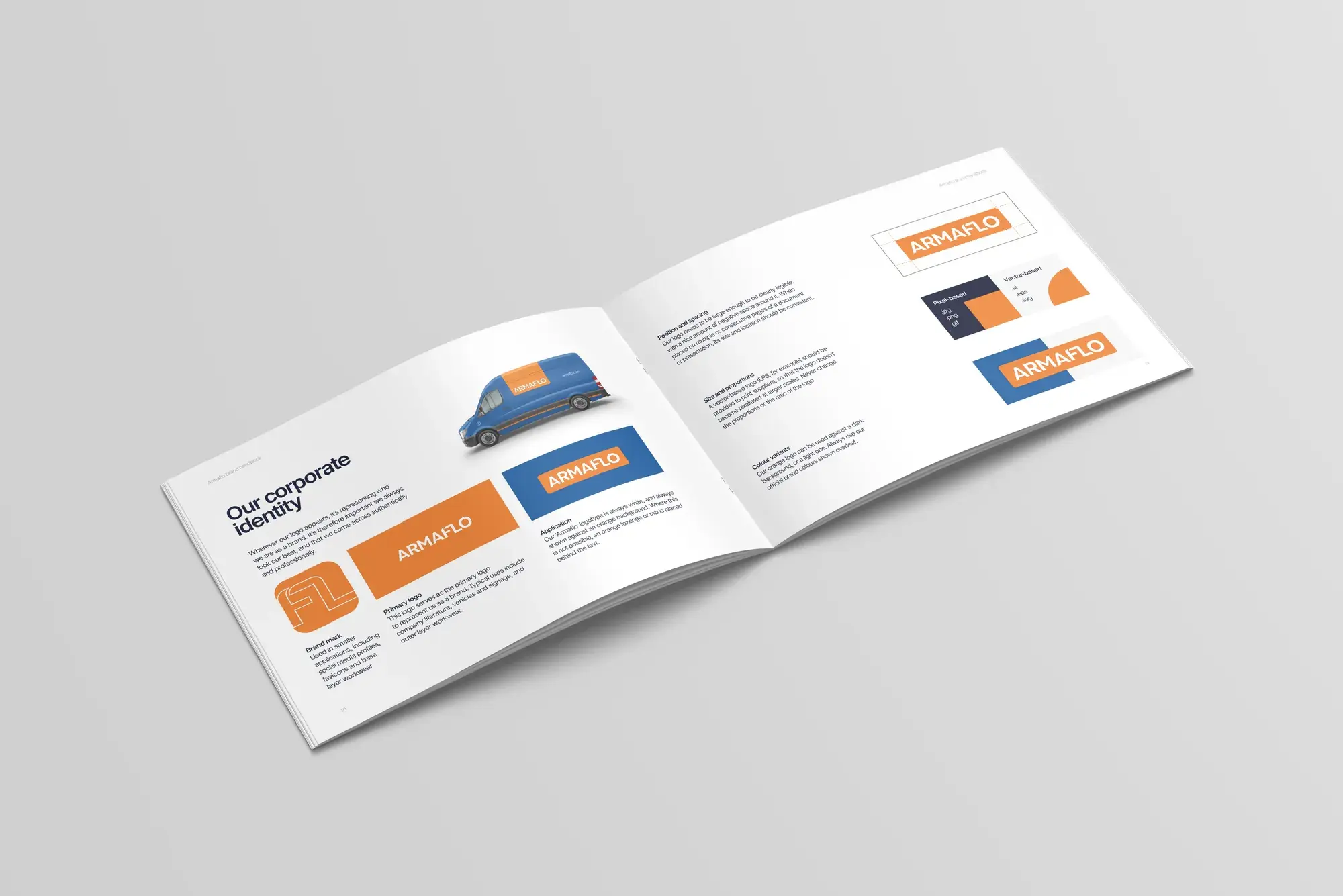
If you're building a new identity or your current guidelines need a refresh, we design brand identities and guidelines and the everyday graphic design that brings them to life. You can see a brand book we designed in our Armaflo case study, or start a project with us.
- brand guidelines
- brand identity
- brand book
How we can help
Brand Identity
Strategy, identity systems and guidelines that make a brand recognizable.
Graphic Design
Print, digital and presentation design that keeps your brand sharp.
Related articles
Branding5 min read
Logo vs Brand Identity: What's the Difference, and Which Do You Need?
A logo is the signature. A brand identity is the whole handwriting. Here's what each one includes, and how to tell which your business actually needs.
Product & MVP4 min read
How to Scope an MVP: Build Less, Learn Faster
An MVP isn't a smaller version of your product. It's the fastest way to answer your riskiest question. Here's how to scope one properly.
Web Design5 min read
How to Write a Website Design Brief (With a Free Template)
A good brief is the cheapest way to get a better website. Here's what to include, why it matters, and a template you can fill in today.
Have a project in mind?
Tell us what you're building. We'll get back to you with questions, ideas and next steps.