Ironshore Brewing
A brand identity for a craft brewery and taproom on Lake Superior: logo, can labels for a core range, taproom signage and merch
- Client
- Ironshore Brewing
- Industry
- Craft brewery
- Location
- Duluth, Minnesota
- Services
- Logo and identity, Packaging and can labels, Taproom signage, Merch design, Brand guidelines
- Year
- 2026
- Project
- Self-initiated concept
Overview
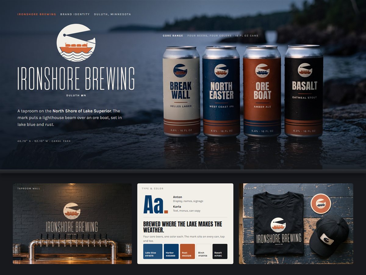
An identity for a Duluth brewery and taproom that puts a lighthouse beam over an ore boat, set in lake blue and rust. It carries from the logo to a four-can core range, the tap list and the merch table.
The challenge
Ironshore was opening a taproom on the North Shore with four core beers and no visual identity. The founders wanted something that felt rooted in Duluth's harbor and iron range history without leaning on the usual pine trees and moose. It also had to work on a 16 oz can, a dark brick wall and a black tee alike.
What we did
- 01
Built the system around the logo's mark, a lighthouse beam over an ore boat on Lake Superior waves, and set it in lake blue and rust drawn from cold water and iron ore.
- 02
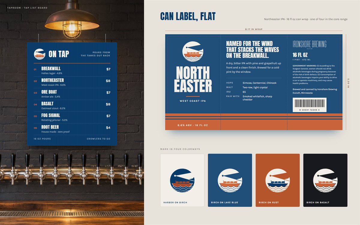
Gave each core beer its own color from the palette (birch, lake blue, rust and basalt) so the range reads as a set on the shelf, with Anton for beer names and Karla for the label copy and legal text.
- 03
Designed one label layout that wraps every can: mark and name on the front panel, tasting notes and hops in the middle, and the warning, volume and barcode on the back.
- 04
Carried the mark into the taproom with a painted wall logo and a navy tap list board, and onto a tee, cap and coaster in four approved colorways.
Design system
Lake blue
#1F4E79
Harbor (logo navy)
#093B69
Rust
#B5552B
Birch
#F2EFE8
Basalt
#17191C
Display · Anton
Aa
Text · Karla
The quick brown fox jumps over the lazy dog.
The goal is an identity people recognize across the room and on the shelf: one mark that holds up at coaster size and wall size, a core range that reads as a family, and a taproom that feels like it belongs on the lake.